
Sunday, April 28, 2013
Sunday, April 21, 2013


Wednesday, April 17, 2013


Saturday, April 13, 2013

Sunday, April 7, 2013


Saturday, April 6, 2013
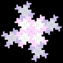
Illusion of Space and Illusion of Motion

Blurred Outlines

Repeated Figure

Exaggerated Size

Vertical Location

Anticipate motion

Multiple Perspective
Sunday, March 24, 2013
Shape/Volume
I'm not exactly sure if I did this right or not. I used the same objects for each of my images but placed them differently.
Image 1

Image 2

Image 3

Tuesday, March 19, 2013
Line
Page 1 with Dry Media

Page 2 with Wet Media ( I had to do these seperately)
Infinite


Contour


Page 2 with Wet Media ( I had to do these seperately)
Infinite

Bold Striping

Stepping Lightly

Just Checking

Page 3
Blind Contour

Contour

Page 4
Volume using charcoal

Volume using cross hatching

Wednesday, March 6, 2013


Sunday, February 17, 2013
Proportion and Scale

Proportion and Scale
This is a copy of a collage I made with all "scenic" pictures. My favorite one is the main focus of the collage; the beach picture that I took in Maine. I think it's great with the different layers of sand and then beach and then sunrise. I also really like the one of the eagle and the clouds. The clouds look huge in comparison to the eagle which makes the eagle actually stand out a lot, I think.
Sunday, February 10, 2013
Emphasis and Focal Point

Absence of Focal Point
There is no focal point in this image that I found online. It's all the same.

Emphasis by Contrast
This image I found online and the focal point is the butterfly as it completely stands out from the background.

Emphasis by Isolation
This image I found online and the focal point is definitely the red pen/marker as it sits up away from the rest of them. You are completely drawn to that one item.

One Element
This image was found online as well and the tree being colored and the rest being black and white makes it an great example of "One Element"

Emphasis by Placement
This is a great example that I found online of emphasis by placement as you are drawn right to that drooping flower out of the vase. If this drooping flower was right in the front/middle of the vase of flowers it wouldn't be nearly as emphasized and wouldn't be a focus at all.
Sunday, January 27, 2013
Ideal 2D design


Chaotic Unreadable

Continuation

Figurative

Non-objective Unity

Organizing Grid

Proximity

Repetition with Similarity
Repetition with Variety

Example of grid as an organizing factor and form of continutity

All images above were found through Google. I think the Chaotic unreadable image speaks for itself. You really cannot see what any of it is! The continuation image is shapes upon shapes. It never really ends. You see and follow one shape which leads you into seeing and following another shape and so on. The figurative image shows an organization and leads you into seeing something within the image whereas the non-objective image certainly has continuity and unity but isn't really of anything. My organizing grid image is examples of organizing text or images for a document. My example of proximity is a good example, I think because it would not be nearly the same image if those people weren't near eachother or in that same layout. Repetition with similarity is pretty self explanatory as it is the same designs and shape with a little change of color. The repetition with variety is very repetitious as fars as the circles however what is inside each circle is very different giving it variety.
Subscribe to:
Comments (Atom)