I think this example is great! I love kids and this little girl is so cute! It's a painting versus a graphic or design necessarily but I still really like it!
Chaotic Unreadable
Continuation
Figurative
Non-objective Unity
Organizing Grid
Proximity
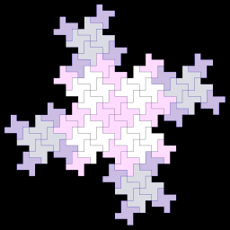
Repetition with Similarity
Repetition with Variety
Example of grid as an organizing factor and form of continutity
All images above were found through Google. I think the Chaotic unreadable image speaks for itself. You really cannot see what any of it is! The continuation image is shapes upon shapes. It never really ends. You see and follow one shape which leads you into seeing and following another shape and so on. The figurative image shows an organization and leads you into seeing something within the image whereas the non-objective image certainly has continuity and unity but isn't really of anything. My organizing grid image is examples of organizing text or images for a document. My example of proximity is a good example, I think because it would not be nearly the same image if those people weren't near eachother or in that same layout. Repetition with similarity is pretty self explanatory as it is the same designs and shape with a little change of color. The repetition with variety is very repetitious as fars as the circles however what is inside each circle is very different giving it variety.


No comments:
Post a Comment